Juxtaposition With Water colors
Juxtaposition (n.) - when two things are combined together in a certain way where they give contrasting effect.
In this project we used Juxtaposition and water colors to create our works of art. We were told to find pictures of the internet that had very bold colors and combine them to later paint with watercolors. During the process of this project we also explored propaganda and idea making and about the impact they can have on peoples thoughts. We learned about copyright issues and read an article talking about someone using another persons image to create their own work of art with a totally different meaning than the intended pictures. Below are the two pictures I combined (juxtaposed).
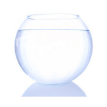
|
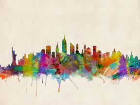
|
In the water color potion of this project we used a trace-n-transfer process to get our combined images onto water color paper. This was an interesting approach and I definitely learned a new and fast way to transfer images with only a pencil. Even though I got through the tracing and transferring I still had to water color. This portion of this project became more difficult for me because I wasn't a very good water color artist. I wasn't able to get the right design and right colors, also the first time around it wasn't very neat. When I asked for help from other people it as interesting to see different people's approaches to water colors, some say put more paint and less water, and others say just press harder. All this feedback also really helped shape my next draft, clean up the splats all over your paper, there seems to be very abstract shapes try it simpler, keep the colors really bold it helps the image stand out. Here are the pictures of the two drafts I created.
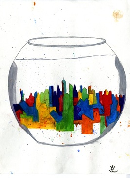
1st Draft
|
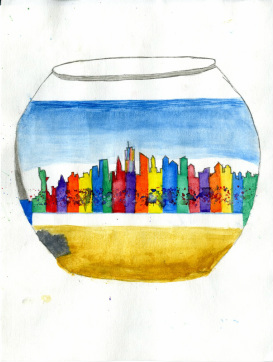
2nd Draft
|
